As part of a weekly build project for Lambda School, I am creating two visualizations based on data.
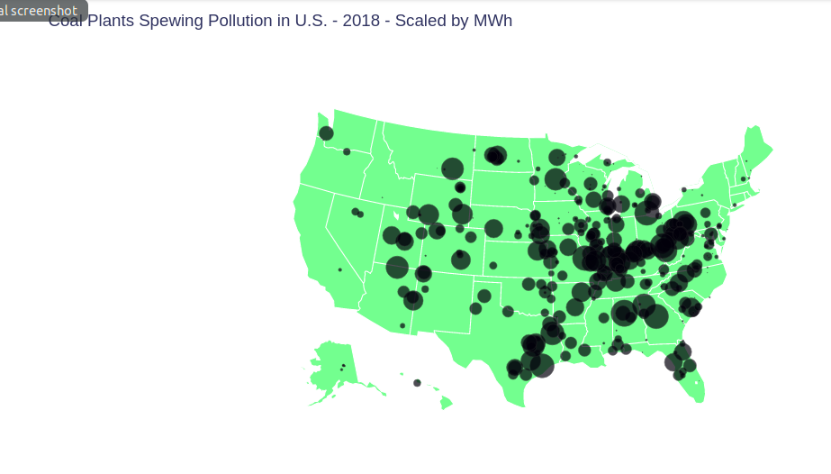
My first is a bubble map showing the location of coal plants in the United States in 2018, with sizes of bubbles scaled by the power generated, using coal, at each plant.
My work is stored at github.com/gptix/data-visualization/ .
A Google Colab notebook for this first visualization is at here.
Here is the chart:
